Krix Brothers wine label
Client: Mongrel Hill / Krix Brothers
Project: Wine label
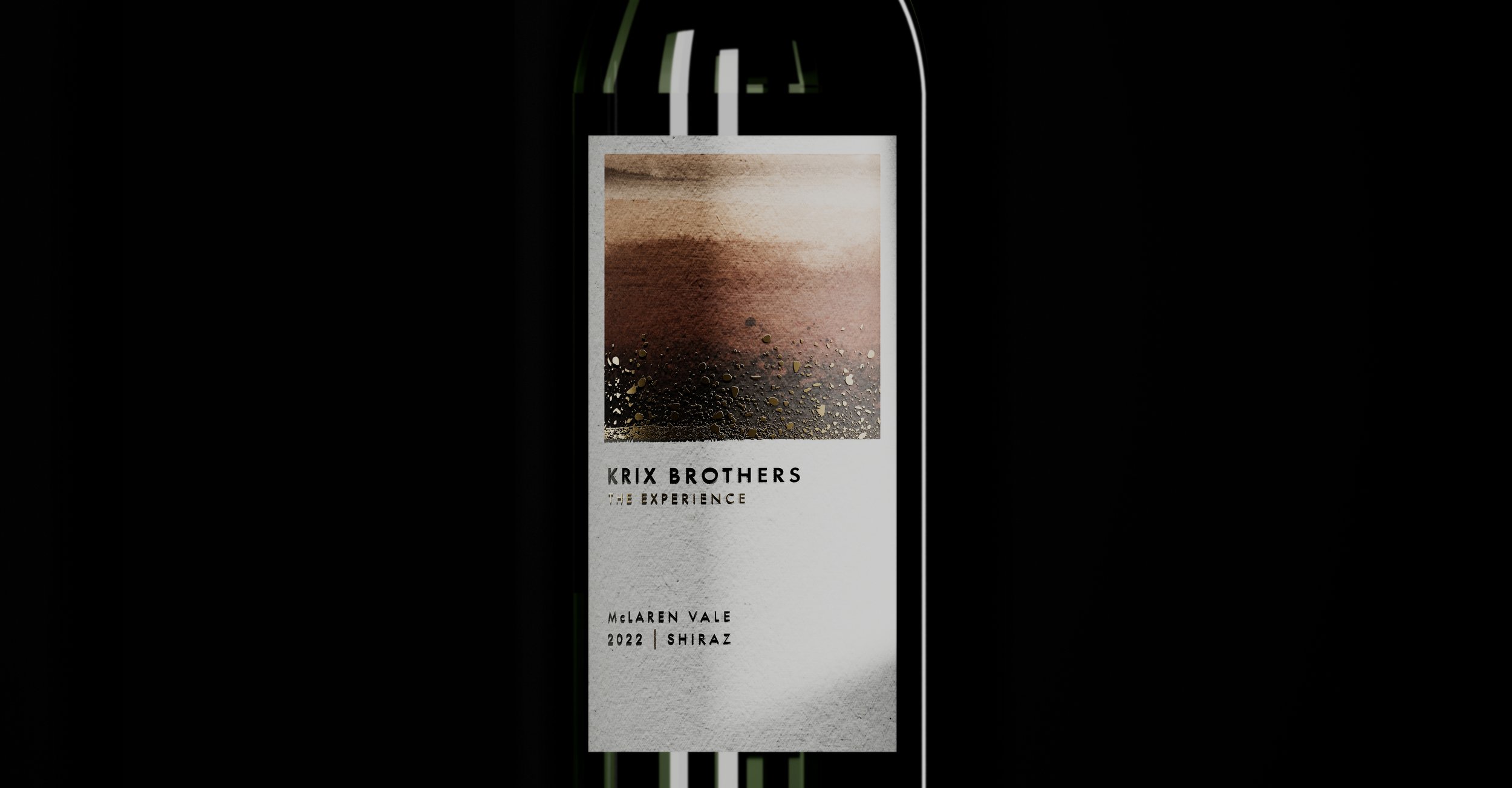
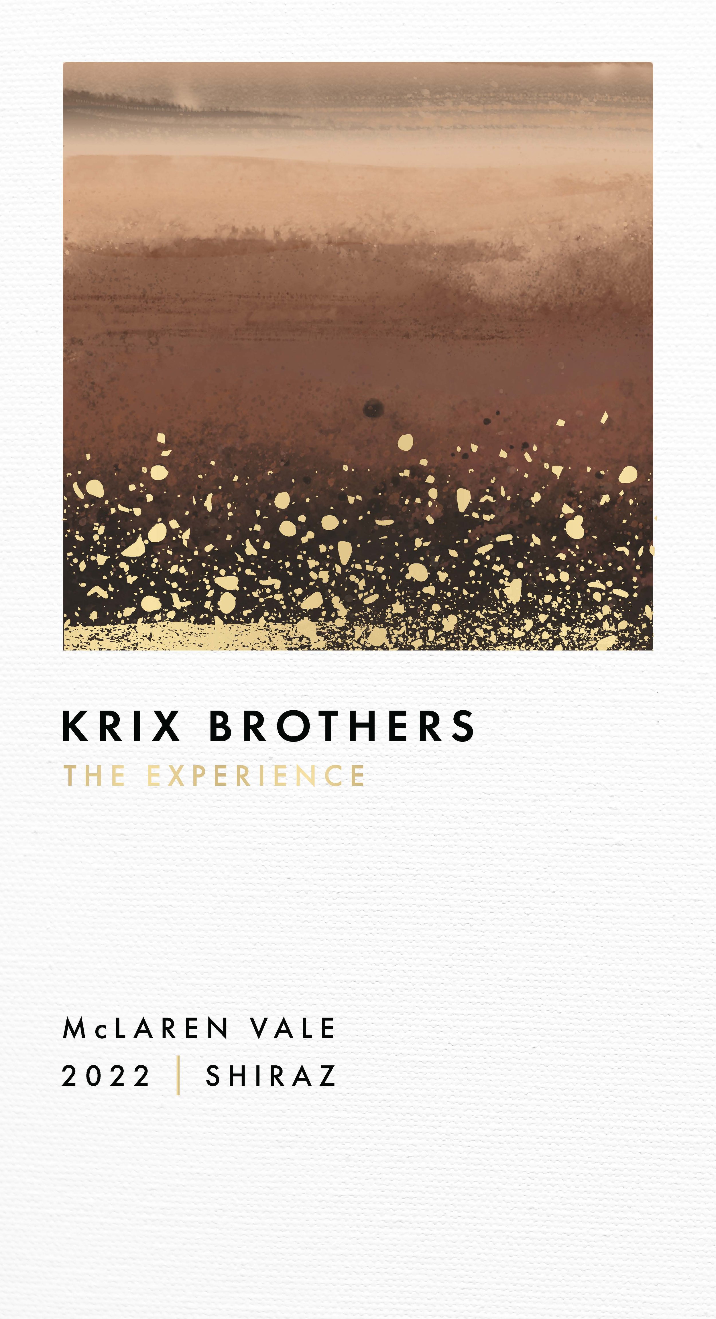
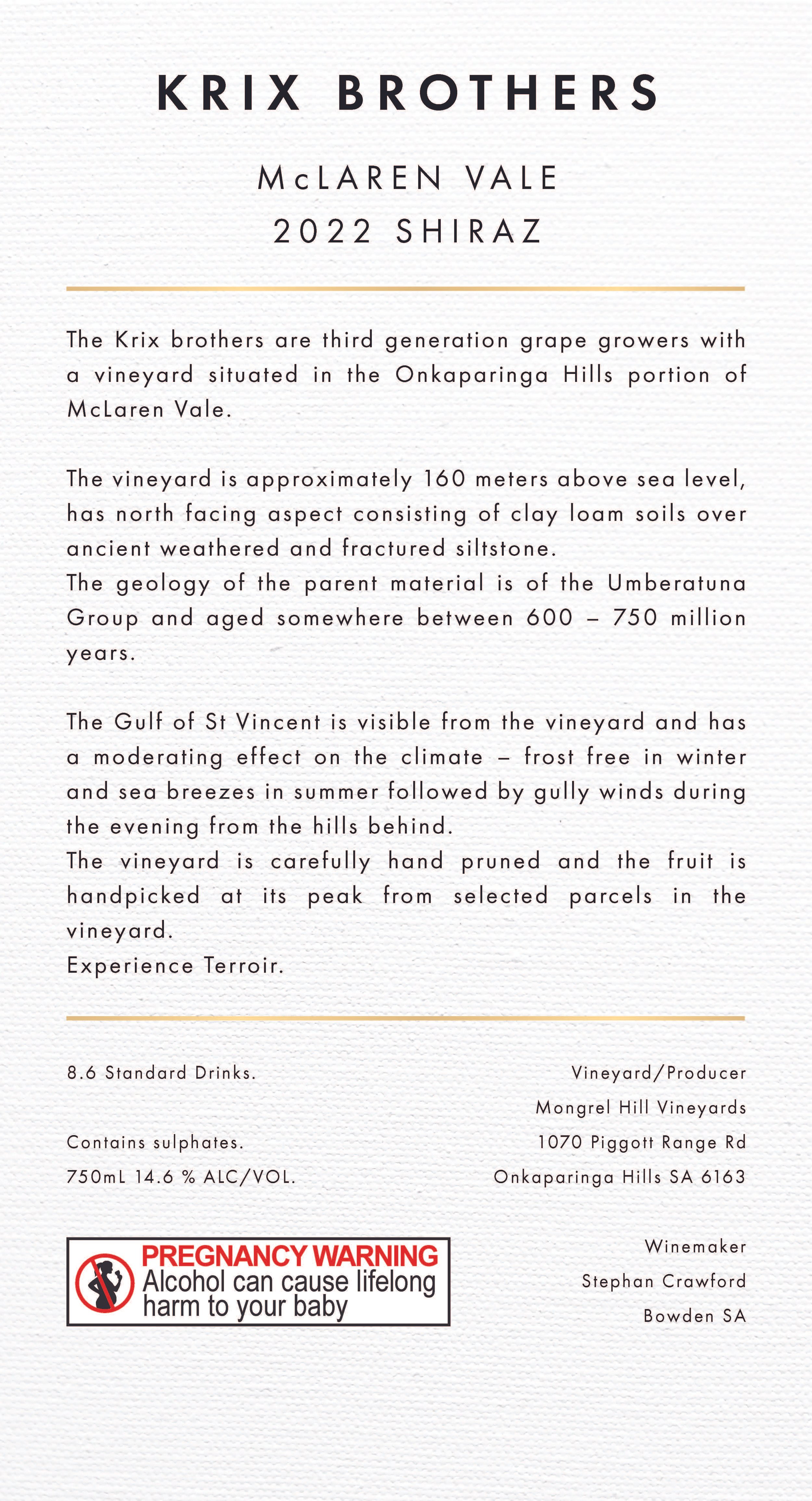
Brief: Create front and back labels for a local wine from McLaren Vale. The design should reflect the distinctive rock formations and landscape characteristic of the region, while maintaining a premium and contemporary feel.
Overview: This project involved revisiting multiple concepts over the span of a year. The client had numerous ideas, but none that could be integrated into a cohesive design. I worked closely with them to clarify their vision, as they were feeling overwhelmed by the decision-making process.
In the end, we settled on a design that truly represents the essence of the land where the grapes were grown. A few key decisions had already been made before I began, such as the use of off-white parchment paper and gold foiling for that premium finish.
For the design, I took inspiration from the soil map and rocks of McLaren Vale. I created a backdrop of earthy browns to honor the local terrain, reflecting the distinctive Australian colors of the landscape. The flecks of gold that sit on top of the terrain represent the rocks below the McLaren Vale surface. The typography was kept minimal to let the artwork shine.


